Quick Menu Config
quickMenuConfig is a configuration array containing inputs you want to display on the Quick Menu when you component is selected to set/update your component-option values. You can get the Quick Menu to hide/display by calling the relevant UI Service methods
Sample Quick Menu Config
[
    {
        type: 'color',
        key: 'background-color',
        options: {
            borderColor: false
        }
    },
    {
        type: 'button',
        key: 'display-background-btn',
        iconClass: 'fas fa-image',
        label: 'Show Background'
    }
];
Quick Menu Inputs
Your quickMenuConfig is an array of inputs. Each array-item is an object with a type property. The type property will determine how a user will modify that property (by key in the input-object) on the component. See a list of supported quick menu types below.
color
button
Color
    {
        "type": "color",
        "key": "background-color",
        "options": {
            "includeGradient": true,
            "borderColor": false
        },
        "value": this.backgroundColor
    }
Options
-
includeGradient: Booleanenables the gradient tabs in the color-picker interface allowing the user to select gradient colors. -
borderColor: Booleangives the quick menu input the border style to designate it will be styling a border. See below, left image hasborderColor: false, right image hasborderColor: true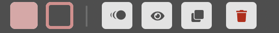
Button
    {
        "type": "button",
        "key": "animate-component",
        "iconClass": "fas fa-image",
        "label": "Animate My Component!"
    }